Friday, April 4, 2025

Cry Wolf Canvas - by Claudia Neubacher


Hi, servus and welcome back to some messy grunge and texture fun! 


This time I entered my studio after what feels like ages without holding a brush or palette knife - and ages it has been! So even if I knew I was up to having some creative fun, I also knew I hadn't  been in touch with my creative mojo for quite a long time. So how do you tackle this? What are good ways to make sure you'll be ending up enjoying yourself and the process?


One way that really works for me is to gather "favourites" - designs, materials, colours and objects that make me feel good by just looking at them. So I picked stencils without thinking at all about how these would go together or create a specific theme. I went for a mix of paints, pastes, brushes, palette knives I thought I might use and in my pants' pockets I found some used rough garden string in black and white, nicely weathered during the winter (as it had been outside, holding protective jute bags in place). When clearing my desk I also kept some tiny snippets of Asian text paper strips from an earlier project for a possible use. 


Also a good way to take off any pressure of having to succed in creating something "special and precious" is to use up old paints and pastes that have already started to dry out a little but can still be applied through stencils, cheap paints and media and some low price substrate to work on like a cheap canvas or some left over cardboard. 

But let's take a look at the stencils I've used:


S861 - Abstract Marks - by Jeanne Oliver
L455 - Wolf - by Roxanne Coble
L792 - ATC Mixup Missigman #1 Art Marks - by Rae Missigman
L433 - Clustered Leaves - by Cecilia Swatton
S621 - Totally Triangular - by Wendy Aikin

There's one more stencil in the picture, but I didn't use that one in the end. It is always good though to have more stencils to choose from. 

I started without having any idea of a theme or look in mind. I only knew I wanted to go by a reduced colour scheme, having black, grey, beige and white as my main colours and adding yellow, maybe orange or rusty tones later. The bright pink somehow demanded to be used during the process. 


But let's start at the beginning! Breaking the clean white of a canvas can be an intimidating moment. Especially when you start without any concept for your piece of art. 


So what I did was use some cheap grey outdoor acrylic paint from a dollar store that needed some good stirring. For that I used the handle of a long old soft brush. When I started scraping off the excess paint afterwards, I found there was still so much of it left on the brush handle, that I decided to scrape that onto the canvas, twisting and turning the handle during the process. I actually liked the result! 
Next I masked a stripe to add some slightly transparent yellow acrylic paint to with a palette knife. 
I heat dried everything thoroughly, before I went on.


Using a second stencil on top of another is a great way to create a textured shape in one go. I used the large open oval shape from Rea Missigman's "ATC Mixup" stencil on top of the "Totally Triangular" stencil and applied carbon black acrylic paint using a stencil brush. 


So far, so good!


Honestly, one of the main goals for this project was to experiment and use the stencils in different ways.
For example, I applied thick white Gesso (that had already started to dry out a little) with a small bristle brush in random circular motions through the oval and circle shapes of my stencil. This way the added shapes looked random and loose, but still had a sharp outline. I heat dried, then  put the stencil back in place again and added some black lines, using the stencil as a mask so the lines' ends would line up with the previously added shapes. 


I also had a small pot of black modeling paste I wanted to use up (or at least save from drying out almost half full) and I decided to use that alongside the lovely "Fallen Leaves" stencil. I applied that to the left side of the canvas and as there was a lot of paste left on the stencil afterwards, I rubbed that residue off the stencil and onto the bottom right corner of my canvas using a baby wipe. 

I found this is a great way to not waste any paint residue and get a soft fading effect at the same time. 


You can see it close up in this picture, which shows me using some dry herbage (or moss?) to "stamp" with. Remember, I was in experimenting mode...

If the outcome of the project isn't of much importance, this is also a great time to practice particular techniques. I used the opportunity to get a bit better at using modeling gel for example. But first I applied some (also a bit dried out) rust paste using the geometrical design on the "Wolf" stencil. 


As you can see I had previously added part of the "Fallen Leaves" design using the baby wipe technique in this corner too. I let the rust paste dry a little (but not fully) and then sprayed on some orange acrylic paint. I created some drip lines and while these were left to dry, I applied the garden string using the modeling gel and a fine tip palette knife. Later I carefully heat dried everything, before I added some white spray paint on top. 

At that point I found my canvas needed its "star" - my beloved wolf (one of my all-time favourites...see HERE). Instead of stenciling it in place with white paint, I used the stencil to draw the outlines using a black archival ink fine tip pen and later filled in the paint using a small bristle brush. I also added some spying eyes (from the same stencil) for a bit of a mystery touch. 

Before I went to sleep and let my canvas sit for a while, I also added more white spray paint in some spots where I found I had added too much texture in black. That was followed by some tiny yellow dots (through the stencil from the October2016 StencilClub set) and more yellow (scraped on, using a palette knife). 


A new day - some new ideas!

I found my garden string looked like a cloud - so I added some falling rain here and there. Now a story started to unfold! 


Suddenly there was a mysterious hand...dangling in the wind...a sign from above? A warning? Food for my poor hungry wolf? 


I went in with an ordinary graphite pencil and traced or filled in some of the stencils' shapes by scribbling randomly and outlining. I also added some scribbling around the rain cloud. 

Finally I added some handwritten text in spots that I found still needed more interest. I adapted a quote from a very successful Neue Deutsche Welle (New German Wave) song from the Swiss band Grauzone (Grey Zone) that goes: 

Ich möchte ein Eisbär sein (I want to be a polar bear)
im kalten Polar. (in the cold polar circle)
Dann müsste ich nicht mehr schrei'n (then I wouldn't have to cry anymore)
Alles wär so klar! (Everything would be totally clear)


Of course I had to change the "Eisbär" (polar bear) into "Eiswolf" (polar wolf), but the text definitely tells the story, doesn't it? And those who know the song, know that the famous refrain says that "polar bears never need to cry!" - so there's some poetic depth in it, don't you think? ;)


I didn't like the plain white wolf body, so he got some red and white banded Angora hip warmer (at least that was my husband's interpretation, which I am happy to go by)...


All in all the canvas maybe lacks in consequence compositionwise, but I really loved where this journey took me and had a lovely time messing in my studio. Taking some close ups and editing these on my lap top made me realise, I love a lot of the detail shots and can well image these as little paintings or canvases on their own...so this canvas also is a kind of catalogue for further inspiration and directions to explore creatively. And there's loads of yummy texture and layers whereever you look! But take a look yourselves!


Thanks so much for stopping by!!!!
Hugs and happy creating!
Claudia
xxx


Friday, March 28, 2025

How to Create Stunning Layered Effects with Stencils and Masks on Black Paper

Hello everyone! Jane Bellante here. I am so grateful to be back with an art journaling tutorial.  Have you ever struggled with getting crisp, layered effects when using stencils with pan pastels, sprays, and mica powder? If your designs smudge, lack contrast, or disappear into the background, I have the perfect technique for you.

In this tutorial, I’ll walk you through my step-by-step process for creating depth, dimension, and rich, layered effects with stencils on black paper. Then, you’ll see how I bring a steampunk bird to life with Color Bloom Sprays, Pan Pastels, mica powders, and embossing ink.

If you’ve ever felt frustrated while stenciling with mixed media, this method will change the way you create.

Let’s dive in!

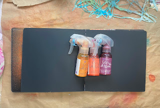
Step 1: Creating a Dynamic Background with Color Bloom Sprays

I started with a black paper journal and my Color Bloom Sprays. These sprays are fantastic for building vibrant layers, especially on dark surfaces. I randomly sprayed three different colors, letting them overlap and blend naturally.

Don't stress about placement—just let yourself play! The organic blending creates the magic.


Once the page was fully covered, I dried the sprays with a heat tool. You can also let them air dry, but the heat tool helps move the colors around, creating unique textures.


Step 2: Layering with Pan Pastels for Depth

Next, I grabbed the Open Bare Wisteria Vine Mask and my Pan Pastels in magenta, gold, and a deep orange shade. These colors show up beautifully against the metallic spray background.

Using a makeup sponge, I carefully pressed the pastel through my stencil while holding it in place to prevent shifting. This step is where the real depth and texture begin to build.

Turn your stencil as you go to avoid a repetitive pattern. This creates a more organic look.

I kept layering and experimenting with color until I achieved a bold, dimensional effect.


Step 3: Adding a Steampunk Bird and Stencil Detail with Mica Powder

For the focal point, I used a fussy-cut steampunk bird printable

Using Versamark embossing ink, I sponged the ink through the Circle Rays 6 Stencil, then brushed on mica powder for a brilliant metallic shine.

Mica powder sticks beautifully to embossing ink! This step adds a luminous glow that makes the design pop.


Once my steampunk bird was glued down with a UHU glue stick, I realized the mica powder transferred onto my fingers. To bring everything together, I sponged more Versamark ink directly onto the bird, then dusted on more mica powder for a cohesive look.

Step 4: Adding a Poem and Finishing Touches

To complete the spread, I created a small poem and printed it out. Once cut into strips, I auditioned different placements before gluing them down.

If you print text from your computer, it may look too stark against your page. To blend the poem into the design, I used Fossilized Amber Distress Ink with a small brush to tint the edges of the text strips.


As I worked, my fingers picked up some magenta Pan Pastel, which transferred to the poem strips—a happy accident that added an extra blended effect!


You can watch the whole step by step tutorial on YouTube right here:


Final Thoughts

This project was so much fun and an easy way to explore layering with multiple mediums. If you’ve been hesitant to experiment with stencils, mica powders, and pastels, I hope this inspires you to try them in your next spread!

Stencils Used:

Open Bare Wisteria Vine Mask

Circle Rays 6 Stencil

Key Takeaways from this Tutorial:
✔️ Use Color Bloom Sprays to create a vibrant base on black paper
✔️ Layer Pan Pastels through stencils for rich texture and depth
✔️ Mica powder + embossing ink = a luminous metallic shine
✔️ Blend printed text into your page with Distress Inks

Where to Find Me:
📌 Website: janebellanteart.com
📌 Instagram: @janebellanteart1
📌 Facebook: @janebellanteart

Let me know in the comments—what’s your favorite way to layer mixed media in your art journal?

Happy creating!

Jane Bellante


Friday, March 21, 2025

Creating More Stenciled Grungy Papers!


Hello Friends! Nicole back with another grungy paper tutorial, this one a bit bittersweet.

After three incredible years with the Creative Team, this is my final post. It has been a true honor to do what I love for StencilGirl®! I have met so many of YOU creatives who also love stencils, and there is nothing better than inspiring you to create and use those stencils!

This is not a forever goodbye. I'm looking forward to focussing my time on designing more stencils for StencilGirl® and sharing my creations, as always, over on Instagram and my YouTube channel. And, you never know when I might make a surprise appearance here! 

With that, I wanted to leave you with one more grungy paper tutorial! I gathered a handful of 9x12 stencils that I haven't had a chance to play with along with my favorite Payne's gray and just played.

And, oh how I needed to play!


To begin, I always lightly gesso my papers. This helps add some integrity to older papers and allows the paint and water to move more easily on the page.


The process is quick, and it doesn't matter if entire page is perfectly covered. My process varies each time, but this session I was using up some gesso that I had turned over like ketchup to get the last bits out! I sprayed my papers with water and added gesso with my brush.


I’m using papers from an old ledger, but any papers will work! Old book pages are fun, too. Just make sure they aren't too thin and brittle. Ledgers aren’t always easy to find, so if you want to add that fun handwriting layer, you could always stamp or scribble all over paper before stenciling.


Creating the Papers 

Once all the gessoed pages were dry, I started making my papers. The general process is the same each time, but I find that often I get a little more creative and adventurous as the playtime goes on. Oftentimes, I don't want to stop!


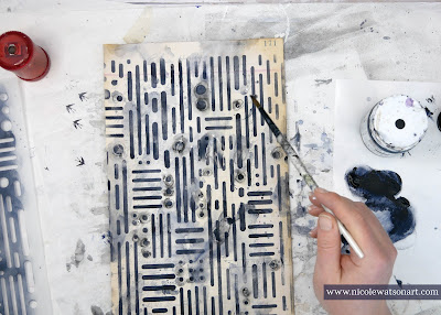
I simply use an applicator with paint through the stencil. Then, I add water + watered down paint and scruff up the stenciled image to distress it. 


One thing I always keep in mind, is that I'm creating moments. It's not important to me that the entire paper is a work of art! I like to have variations on each page that I can use in different ways as needed for collage, backgrounds, journals, and more.


My first couple papers were simple, and then I changed it up a bit.


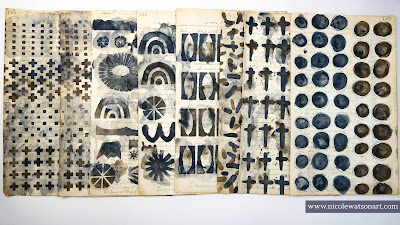
Urban Rhythm Matrix


After adding the Payne's gray through the stencil, I traced around all the circle shapes with my stabilo all in graphite and black and then activated it with water. I put the paper aside and moved on, but when I was flipping through the papers at the end, I thought it needed something else. So, I added a bunch of walnut ink. 

Here's what it looked like before the walnut ink:


Fade Horizontal Stencil


For this one, I tried to create an ombre effect, keeping the paint darker to the left and fading it to the right. When I was done stenciling, I added quite a bit of watered down paint to the left side and tilted the paper for drips.


Single Cross Mini


Sometimes, I like to play with the stencil more than one way. For the first one I stenciled here and there with Payne's gray and then added raw umber to fill in the gaps. On the second paper, I used mostly raw umber and watered down Payne's gray for contrast.


Shape Collection


My ledger papers are just a little more narrow than the stencils, which really isn't a problem most of the time. However, for this fun stencil with all the different shapes, it cut some of them off. I didn't let that bother me! Any image, even if partially stenciled, can find its way into collage!

I stenciled the first paper "as is" through the stencil. I used both Payne's gray and raw umber.

For the second one, I repeated some of my favorite shapes. In doing this, I fell in love with the image (and how I distressed it) of the 3 leaf-like shapes cut out from the rectangles. So, I played with that image on its own. I cannot wait to play with this more and add it to future artwork. Such a great discovery through my playtime!

If you've never played with Payne's gray + raw umber, I highly recommend you do! They create the most wonderful charcoal-black color when they mingle together.


Boro on Steroids I


Since this stencil has so many wonderful images, I decided to play with each one separately. In sticking with my purpose of playing with stencils I had not yet, I didn't use the chevron part as I had used that one previously on a journal page.

For the jelly-bean like shapes, I originally only stenciled them in Payne's gray on one side with the intention of using raw umber on the other...but then I ended up just layering both for more interest! 

After the circle shapes were dry, I traced around them loosing with the stabilo all in graphite.

I just used Payne's gray in the cross-like shapes and added watered-down raw umber with it. I liked stenciling it in two different directions for completely different looks.


Soulful Scribbles Dots Dash


At this point, my water and sponges were getting a bit dingy, so I changed out the water and sponges to start fresh. I often change them out a couple times during my play sessions.

Since this stencil is so detailed, I kept the grungy play pretty simple, except instead of raw umber, I added walnut ink.

I cleaned off some of the extra puddles with a blank ledger sheet that I used for the next stencil.

Stitch ATC


For my final stencil, I played much like I did with the other patterned stencils above. I enjoyed making larger patterns with a couple of my favorites.

I also used walnut ink on this one, which creates a similar charcoal-black color like the raw umber when mingled with the Payne's gray.


Phew! That was a lot of amazing playtime, and I did not want to stop! I had so much fun making these papers and discovering amazing shapes and patterns in these stencils.


You can watch the grungy paper play in action in the video below:


Links to my other grungy paper/technique tutorials:


Thank You!

As I close out this blog and season, I just wanted to take a quick moment to thank you for all your kindness. I also want to thank the team at StencilGirl® for this amazing opportunity. It has been such a fun few years playing with these stencils.


I hope you create some grungy papers soon!


-Nicole


Connect with me on


Stencils


Supplies:

  • Gesso
  • Vintage book and ledger papers, ephemera
  • Matte medium
  • Acrylic Paint (I used Golden SoFlat Payne's gray & raw umber)
  • Round applicator
  • Walnut Ink
  • Stabilo all in graphite & black